AI Health Platform

Luna Health AI

Comprehensive AI-powered health monitoring — six health domains, from metabolic to epigenetic, in one dashboard.
Role

Lead Product Designer

Timeline

~10 Months

Industry

HealthTech · Consumer AI

Scope

Product, Mobile, System

Description

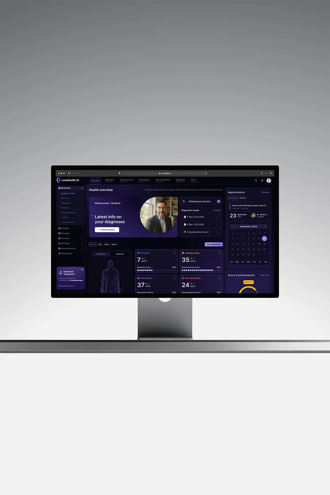
LunaHealth AI gives patients a complete picture of their health across six domains — Metabolic, Cardiovascular, Neurological, Musculoskeletal, Epigenetic, and Brain Health. Every module is data-rich and clinically grounded, but built for non-medical users.

Product Designer — designed the system, data visualization, scoring, and the overview that ties all six domains together.

Scope of Work

Background Line

The problem

Clinical completeness isn't comprehension.
A platform can be exhaustive and clinically correct and still be useless to the person it's built for. Six domains of medical data mean nothing to a non-medical user without translation, meaning, and a next step.
Unreadable
The data was clinically grounded but unreadable to a layperson — completeness without comprehension.
Overload
Six domains in one place risks overload — a dashboard impressive to a clinician and paralyzing to a patient.
No reason to return
One-time diagnostics don't change behavior; without a reason to return, the picture goes stale.

Research & Discovery

Chasing meaning, not more data
01
What we assumed
Users wanted maximum detail — show every biomarker and let them explore.
02
What we investigated
Usability sessions and comprehension tests with non-medical users across the six modules.
03
What we found
Users didn't want more numbers; they wanted to know 'am I okay, what's this mean, and what do I do?' — meaning over raw data.
04
What surprised us
Engagement depended less on data depth than on a sense of progress — people returned for their score and goals, not the biomarkers.

The insight that changed everything

“For a non-medical audience, the product isn't the data — it's the meaning and the momentum. Comprehension and a reason to return matter more than completeness.”
Clinical data
Plain-language meaning
A reason to return

Design principles

Three rules, each traceable to one insight
01
Translate before you visualize
Every number gets a plain-language 'what this means for you.'
02
Overview first, depth on demand
One readable health picture, with each domain a level deeper for those who want it.
03
Reward progress
Make health a loop worth returning to, not a one-time report.

Strategic decisions

Three decisions that made the bet real
01
Meaning vs. raw data
THE TENSION
Clinicians value exhaustive readouts; non-medical users drown in them. Show everything, or translate it?
THE CALL
Led with plain-language meaning and clear scores, with full clinical detail a tap deeper — comprehension first, completeness second.
THE RESULT
Users could read their status at a glance instead of bouncing off medical jargon.
02
Dark-mode system across six domains
THE TENSION
Six data-rich modules could each drift into their own visual language, fragmenting the experience.
THE CALL
Built a dark-mode design system and a shared data-viz language — charts, gauges, and progress indicators consistent across all surfaces.
THE RESULT
A coherent product where every domain felt like one platform, and new modules shipped without re-inventing visuals.
03
Engagement loop vs. static report
THE TENSION
A clinical report is accurate but inert; gamification risks trivializing serious health data.
THE CALL
Added a scoring system with weekly progress, goals, and challenges — engagement grounded in real metrics, not vanity badges.
THE RESULT
Health monitoring became a recurring habit rather than a one-time check.

Solution Design

Meaning first, depth on demand
The product leads with plain-language scores and one readable overview, with full clinical detail a tap deeper — and a scoring loop that makes it worth returning to.
Health Overview
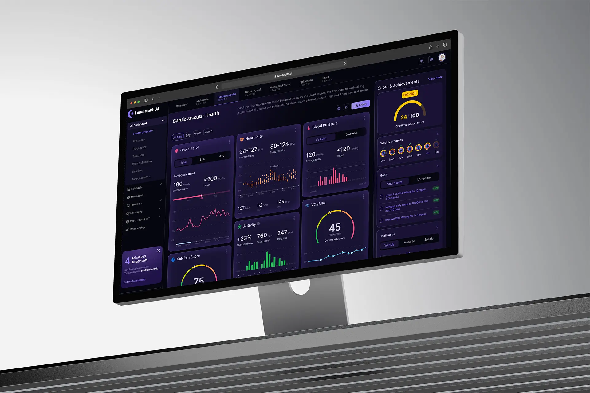
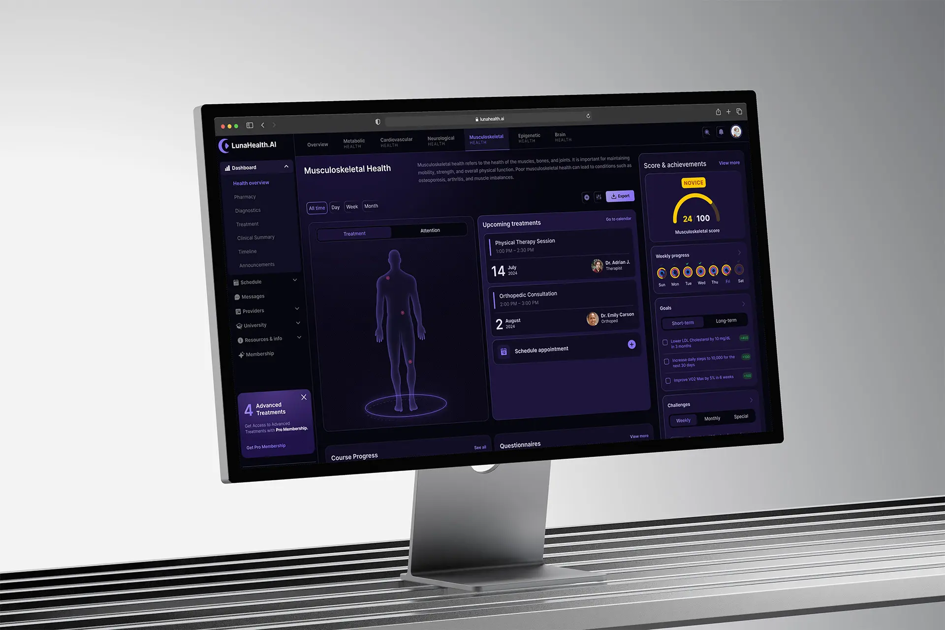
A main dashboard with body map, diagnostic results, appointments, and scores across all six domains.
Health Modules
Individual dashboards for each of the six clinical domains, in one consistent language.
Data Visualization
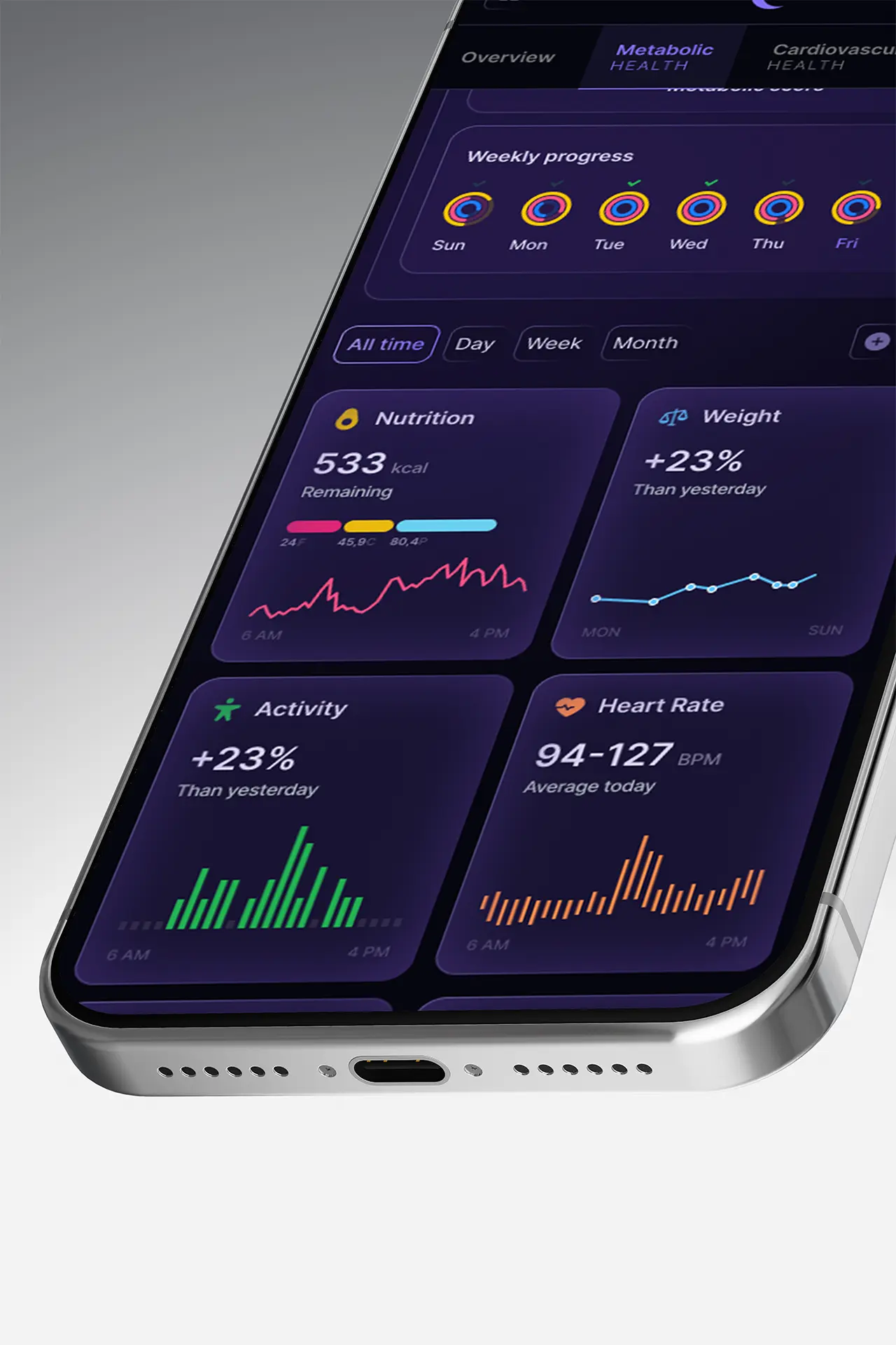
Complex medical data presented through charts, gauges, and progress indicators.
Score & Achievements
A gamified scoring system with weekly progress, goals, and challenges.

Critical Moments

Where the work was actually decided
Comprehension over completeness
I anchored the design in comprehension for non-medical users, pushing back on a data-maximal default in favor of meaning-first scores with detail on demand.
Shared system first
I prioritized the shared system and data-viz language early, so six clinically distinct domains could ship as one coherent product rather than six dashboards.

Impact

Results
45% → 82%
Read their status correctly
Up from 45% before plain-language translation.
~2.1×
Weekly return
After the scoring loop turned diagnostics into a habit.
6
Domains, one dashboard
Unified into one readable picture for non-medical users.
1 system
Dark-mode design system
Kept all modules consistent and sped up new ones.
North-star: users who understood and acted on their health — not users who saw their data.

Reflection

What I'd carry forward
Validate translations with patients earlier
I'd test the plain-language translations directly with patients sooner, since comprehension — not visual polish — is the whole product here.
Tune the scoring balance
I'd revisit how the scoring loop balances motivation against clinical accuracy, so engagement never overstates a serious result.
Clinically complete is easy. Understandable — and worth returning to — is the design.

Let's Work
Together.

Have a project in mind? I'm always open to new ideas and collaborations. Let's talk.

Made in Warsaw with Love. All rights reserved.