AI SaaS Product

Veltrix AI

AI-powered analytics platform for business owners. Connect your tools, ask questions in plain English, get answers with next steps.

Role

Lead Product Designer

Timeline

~12 Months · 0→1

Industry

B2B SaaS · SMB Analytics

Scope

Brand, Web, Product, System

Description

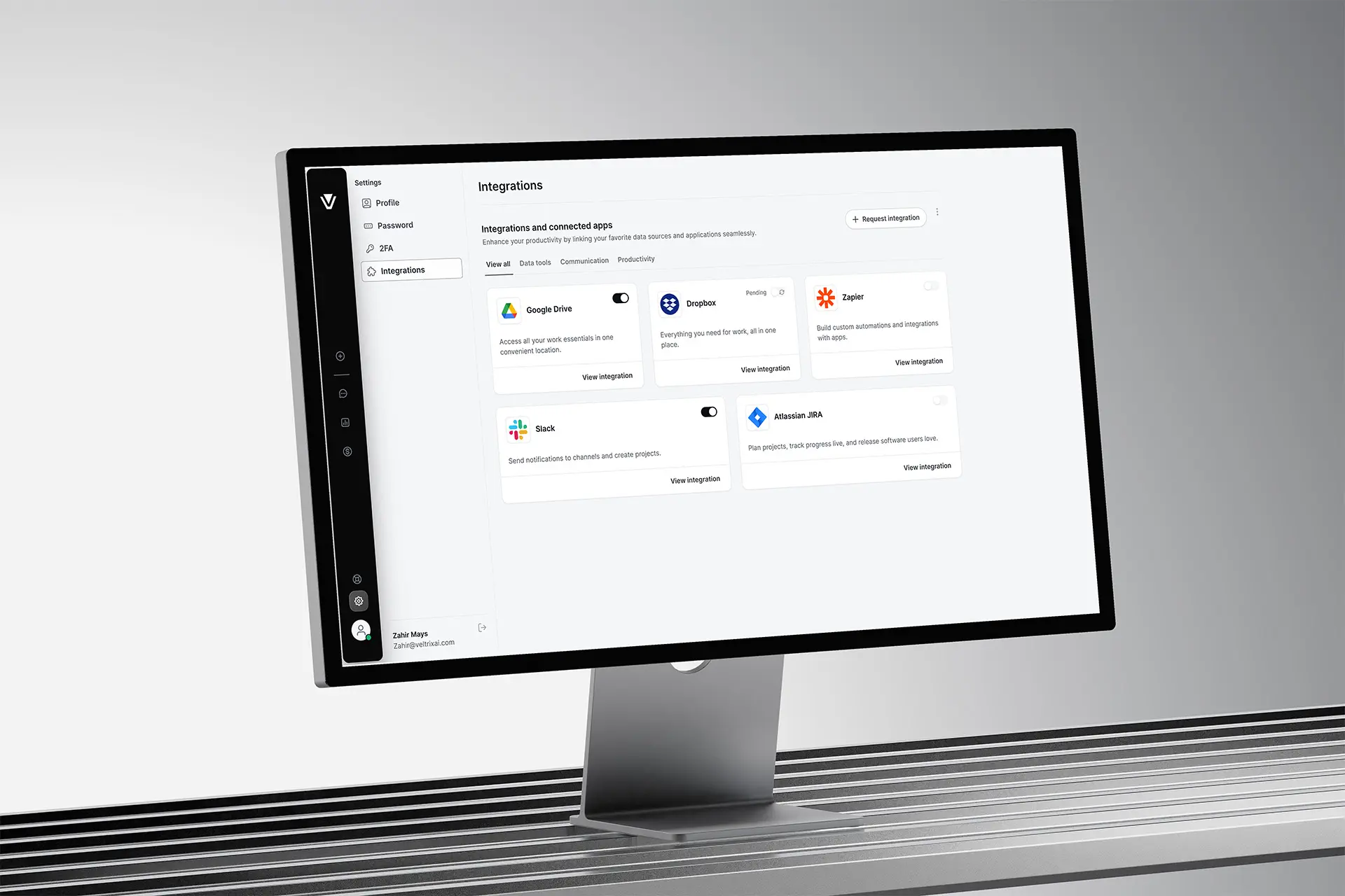
I designed Veltrix AI from zero - an AI analytics platform that connects QuickBooks, Xero, Shopify and HubSpot, and turns raw business data into plain-English insights with actionable next steps.

Lead Product Designer. Sole designer from zero to launch — brand, marketing site, product UX, and design system.

Scope of Work

Background Line

The problem

Owners weren't data-poor. They were decision-poor.
In one of software's most crowded categories, every competitor already showed owners their numbers. The gap nobody filled was the cross-tool 'so what.' Where dashboards are a commodity, the only defensible product is one that makes the decision.
The user
They could see revenue dipped — but not why, or what to do by Monday. The synthesis across four tools lived only in their heads, on Sundays, badly.
The business
78% of signups connected an account. Only 22% were still active at week 4. People reached the product's surface and bounced off it.
The signal
The most engaged owners flooded support asking 'okay, but what does this mean?' — the product was offloading interpretation onto humans.

Research & Discovery

Chasing the verdict, not the chart
01
What we believed
Owners abandoned because connecting four tools was painful and the dashboard was cluttered. The fix, we assumed, was fewer charts and smoother onboarding.
02
What we investigated ?
First-session analytics, 14 owner interviews across retail, services and e-commerce, a teardown of weekly decision-making — and comprehension tests: show a real chart, ask 'what would you do now?'
03
What we learned
Owners didn't study dashboards. They opened them looking for a verdict, didn't find one, and went back to their gut. The chart itself was the friction.
04
What surprised us
The owners who churned read the charts correctly — and still couldn't name an action. Visual clarity had almost no relationship to whether they'd act. We'd been optimizing the wrong variable.

The insight that changed everything

"A dashboard asks a question — what does this mean? — when the owner came for an answer."
Raw data
Plain-English insight
One next action

Design principles

Four rules, each traceable to one insight
01
Answer first, evidence on demand
Never open with a chart. Open with the verdict — the chart sits underneath as proof.
02
Earn trust by showing your work
Every insight links to its numbers and source tool. Low-confidence findings are framed as questions, not claims.
03
One decision at a time
Recommend a single next action; the rest tuck behind 'other options.' End paralysis, don't relocate it.
04
Plain English, owner's words
No 'MRR cohort variance.' Say 'you're keeping fewer repeat customers than last month.'

Strategic decisions

Three decisions that made the bet real
01
Lead with the answer, not the chart
THE TENSION
What does an owner see first — a polished cross-tool dashboard, or a feed where each card states a finding plus one action? The feed was riskier: the model had to commit to a claim.
THE CALL
Ship the insight feed. The research said the answer was the product; a dashboard only re-creates the exact gap that made owners churn.
THE RESULT
Time-to-first-insight collapsed from 'find it yourself' to seconds — and self-serve activation became viable.
02
Design for the AI being wrong
THE TENSION
An LLM will occasionally produce a confident, incorrect insight — and one burns trust permanently. Hide uncertainty for a cleaner feel, or expose it and admit fallibility?
THE CALL
Make every insight traceable: tap to see the numbers and which tool they came from. Lower-confidence insights are framed as questions, not claims.
THE RESULT
'Is this right?' support tickets dropped, and insight tap-through became a top engagement signal. In finance, trust is the product.
03
One next action, never three
THE TENSION
A list of suggestions feels thorough but recreates decision paralysis. A single action risks being the wrong one — but the whole point was to end paralysis.
THE CALL
Recommend one prioritized action per insight, with the rest tucked behind 'other options.'
THE RESULT
A higher action-taken rate per insight — the product ended paralysis instead of relocating it.

Solution Design

One insight card, everywhere
The product resolved to a single atomic unit — a claim, the evidence behind it, and one action — that scaled from the homepage to a phone.
The insight feed
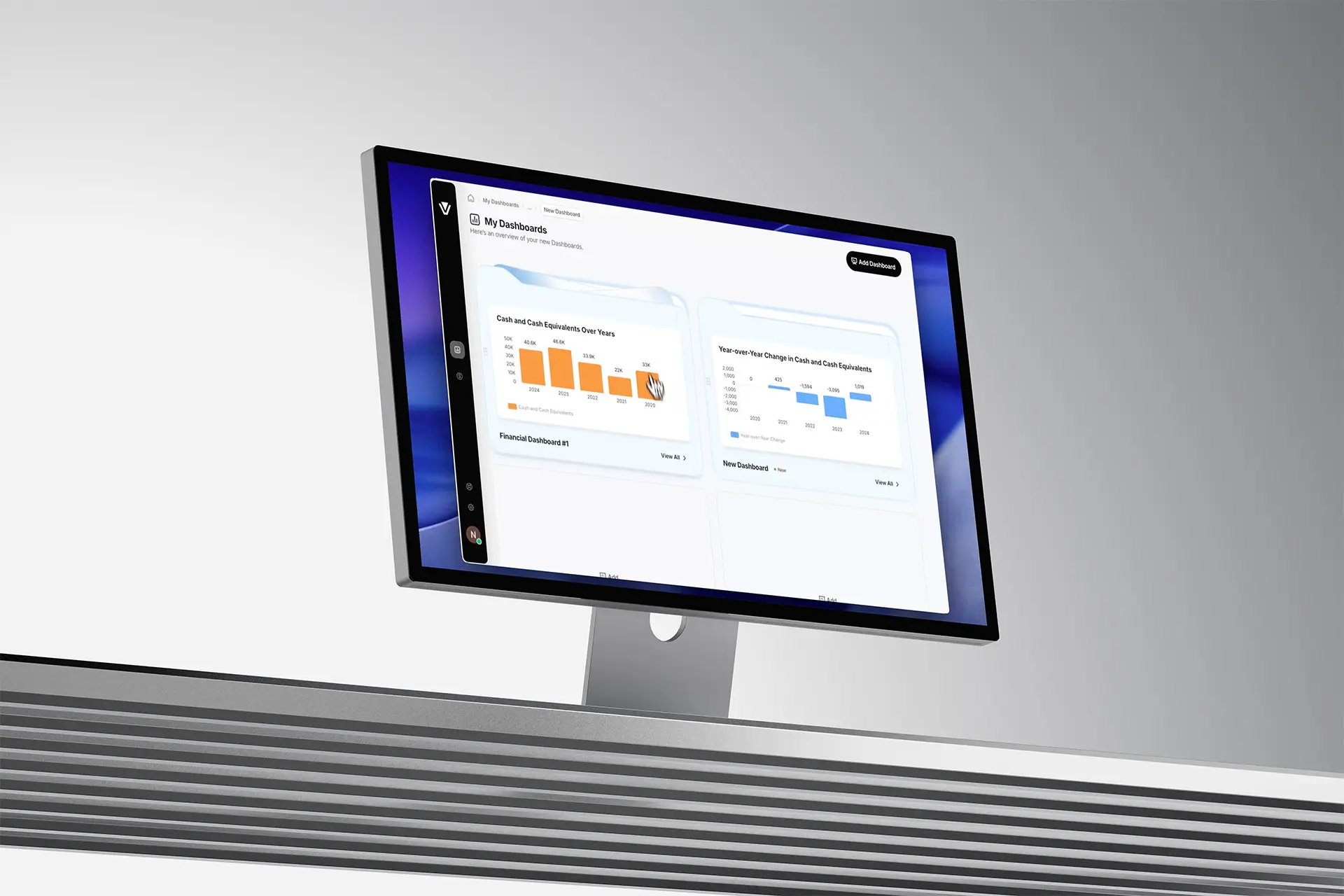
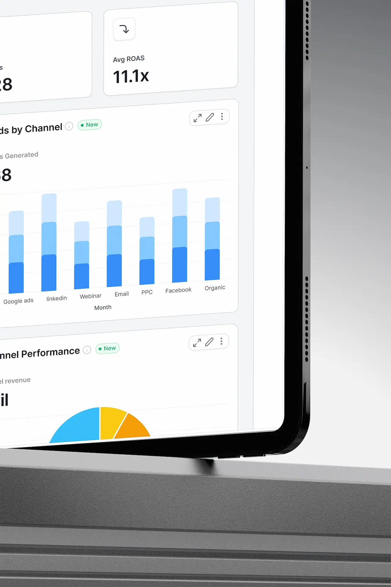
Each card leads with a plain-English finding and one recommended action; the chart sits below as proof. Owners reach an actionable takeaway in under three minutes instead of giving up.
Progressive connect flow
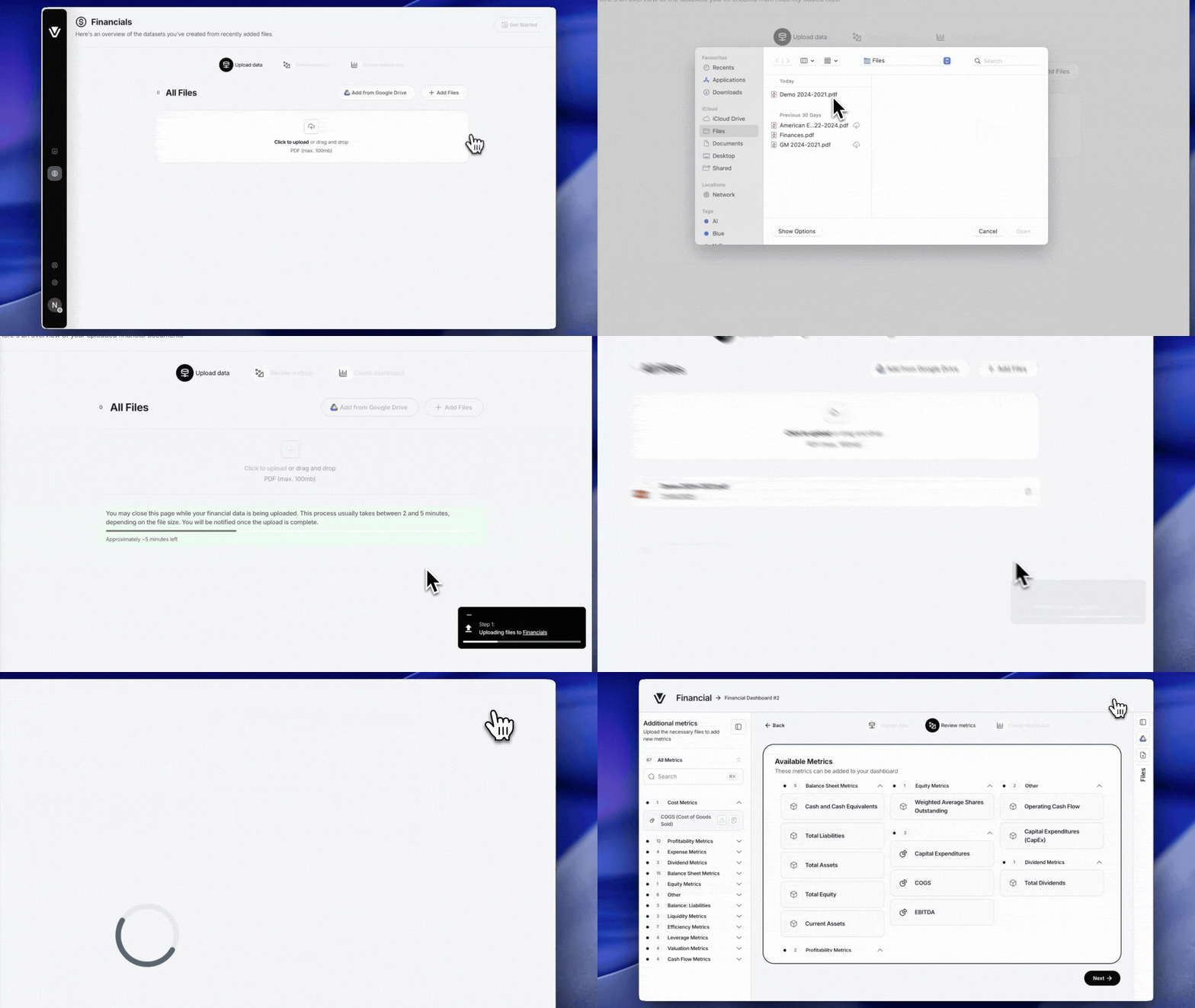
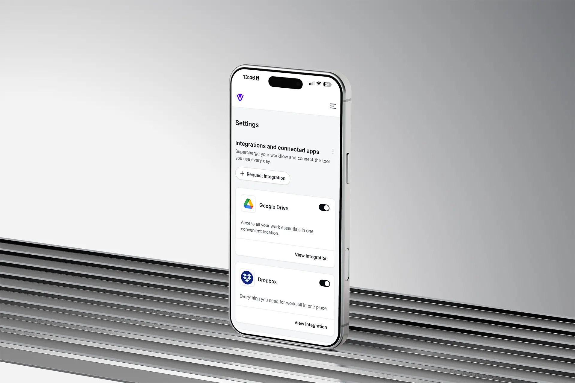
The first connected tool produces a real insight immediately; the rest are invited later, in context — 'connect Shopify to see this by channel.' Value before commitment, fewer abandoned setups.
The traceable insight card
One reusable component carries the claim, confidence treatment, source-tool tag and expandable evidence — so the team ships new insight types without redesigning trust each time.
One model, every surface
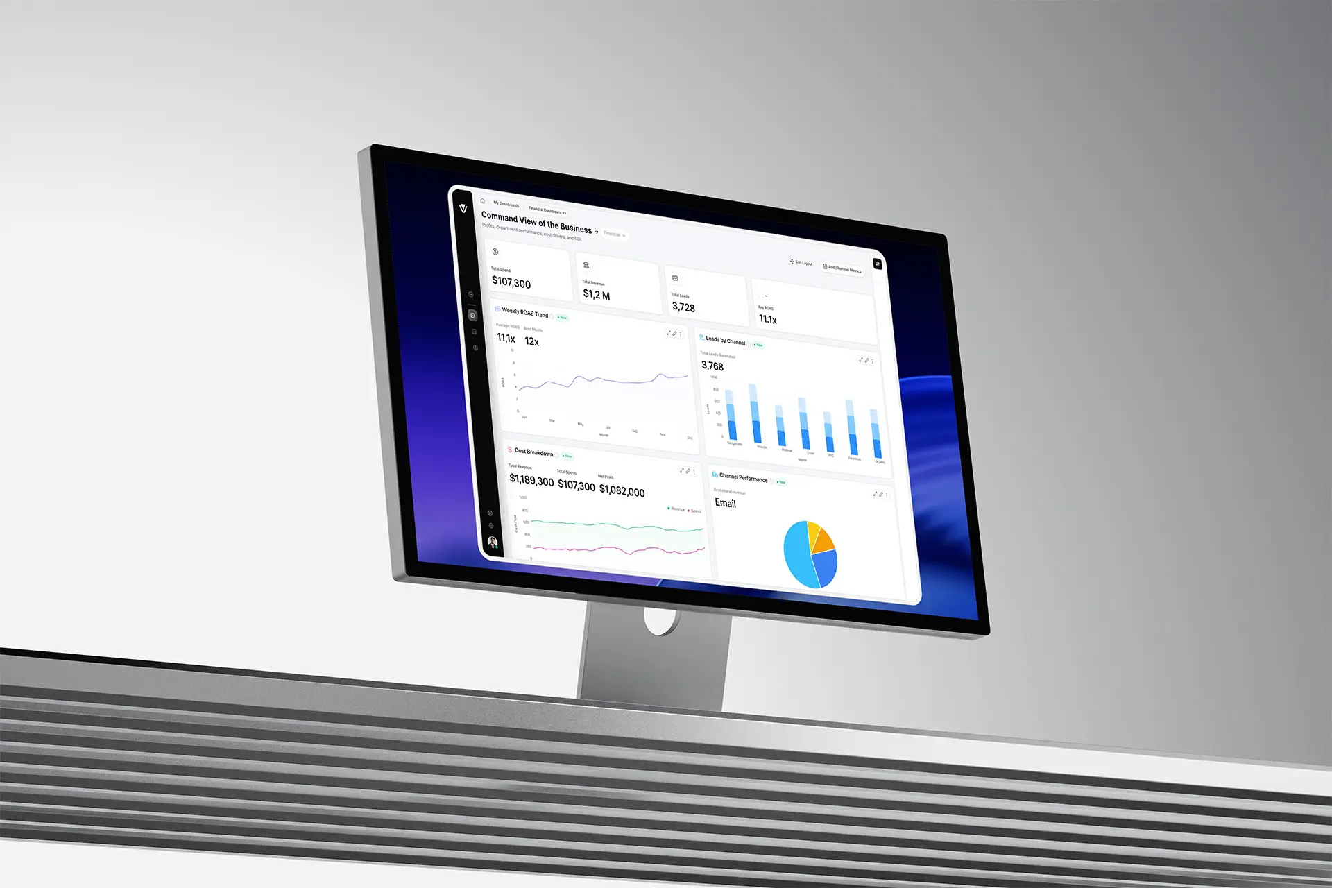
The same insight-card model scales from marketing site to product to mobile. The promise on the homepage is literally the product's atomic unit.

Critical Moments

Where the work was actually decided
The dashboard everyone expected
The team assumed we'd build the cross-tool dashboard. I brought comprehension-test footage — owners reading charts correctly and still freezing — and reframed the roadmap around the insight feed. The footage, not my opinion, won it.
When the AI was confidently wrong
An insight misattributed a revenue dip to the wrong channel. Instead of just tuning the model and moving on, I treated it as a design mandate — and it produced the traceability and confidence system.
API reality vs. the promise
Two of four integrations had flaky, rate-limited data. Rather than caveat every insight into uselessness, I negotiated a data-quality threshold with the data scientist: insights only fire above it; below it, we say so plainly.
Scope vs. ship
To protect the fundraising timeline, we cut a custom-report builder I'd designed. I backed the cut — it served power users, not the activation problem the company needed to prove.

Impact

Results
49%
Week-4 retention
More than double the 22% baseline — the inflection that made self-serve viable.
< 3 min
Time to first insight
Down from days, or never, after restructuring the connect flow.
2.2×
Retention lift
Owners reaching an insight stuck at over twice the old rate.
1
Action per insight
A single prioritized next step replaced decision paralysis — never three.
North-star metric: weekly insights acted on per active account — decisions changed, not charts viewed.

Reflection

What I'd carry forward
What worked
Anchoring the whole product on one sentence — answer, don't visualize — gave every decision, from onboarding to a button label, a single test to pass.
What didn’t
I validated the insight with owners but underweighted how much trust engineering and data would need to deliver it safely. The first AI-wrong moment caught us reactive.
What I'd do differently
Bring the data scientist into discovery, not just delivery. Model fallibility was a core experience constraint — I treated it as an implementation detail until it bit us.
What I learned as a leader
In a crowded category, the win isn't a better version of what everyone ships. It's the conviction to remove the expected thing when research says the job is different.
Veltrix stopped being a dashboard and became a decision tool the analyst you can't afford, in a market full of charts.

Let's Work
Together.

Have a project in mind? I'm always open to new ideas and collaborations. Let's talk.

Made in Warsaw with Love. All rights reserved.