Mobile App Redesign

OMV App Redesign

Redesign concept for OMV's EV charging app — rethinking the driver experience from station search to the active charging session.
Role

Product Designer · Concept

Timeline

~6 Weeks

Industry

Mobility · EV Charging

Scope

Mobile App, UX

Description

A redesign concept for OMV's EV charging app. The goal: simplify the end-to-end charging experience, from finding a station to managing an active session — with a cleaner interface and a smarter information hierarchy.

Product Designer — self-initiated concept redesign. Scope: audit, personas, IA, flows, and the live charging session.

Scope of Work

Background Line

The problem

The anxiety lives after you plug in.
Most EV apps over-invest in the map and under-invest in the moment that actually causes stress: the live charging session. Drivers are left guessing about status, speed, and cost.
The session
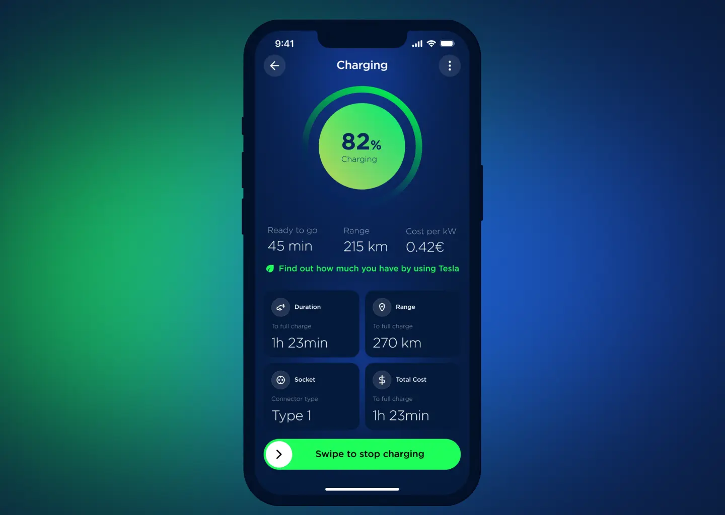
The active session — the highest-stress, highest-frequency moment — was thin on live status, cost tracking, and controls.
The structure
Core flows — registration, charging, navigation, payment, invoicing — were fragmented across the app with no clear hierarchy.
The density
Information density worked against drivers: what they needed mid-session was hardest to find.

Research & Discovery

Chasing certainty, not the map
01
What I assumed
A better redesign meant a better map and station search — faster discovery, richer filters.
02
What I investigated
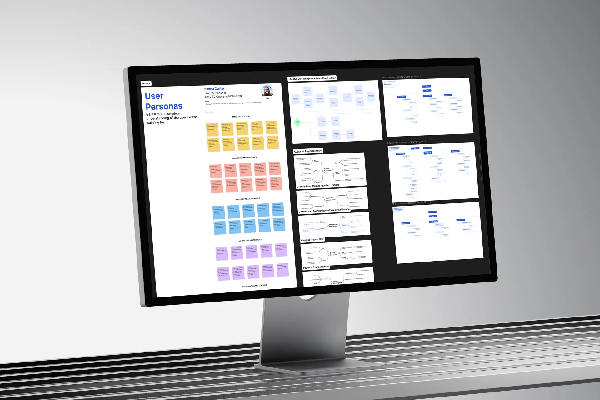
A UX audit of the existing app to locate friction, plus research-based personas mapping EV-driver tasks, pain points, and opportunities across the journey.
03
What I found
Discovery was rarely the blocker. The friction clustered around the active session and the handoffs between charging, payment, and invoicing.
04
What surprised me
Drivers wanted less on screen, not more — certainty about the current charge beat any extra data or feature.

The insight that changed everything

“EV charging anxiety isn't about finding a station — it's about trusting what's happening while you charge. So the active session, not the map, is the heart of the product.”
Plug in
See status & cost live
Charge with confidence

Design principles

Three rules, each traceable to one insight
01
Lead with the live session
Status, speed, and cost are the home base, not a buried screen.
02
One thing at a time
Match the interface to where the driver is in the journey instead of showing everything at once.
03
Make cost & progress legible
Show charge and cost in real time — remove the guesswork that creates the stress.

Strategic decisions

Three decisions that made the bet real
01
Session-first vs. map-first
THE TENSION
The category convention — and stakeholder expectation — is a map-centric home; leading with the session breaks the familiar pattern.
THE CALL
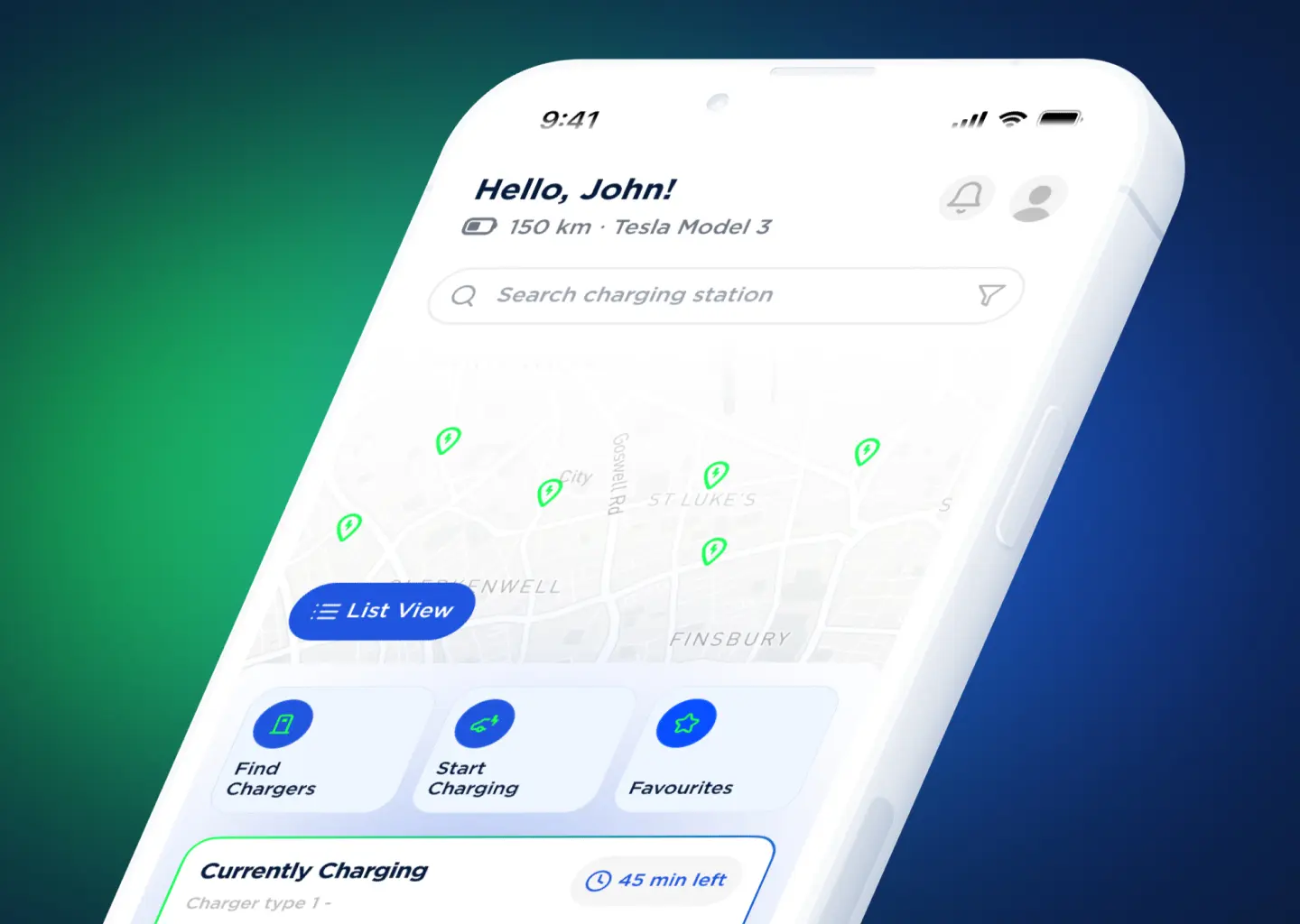
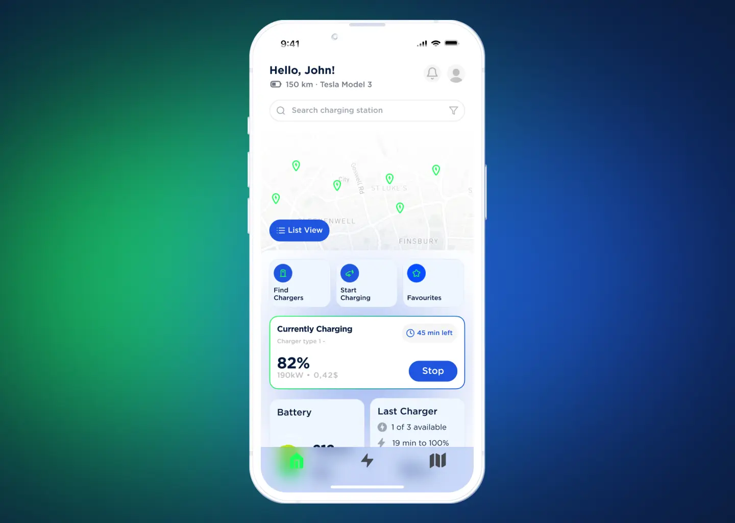
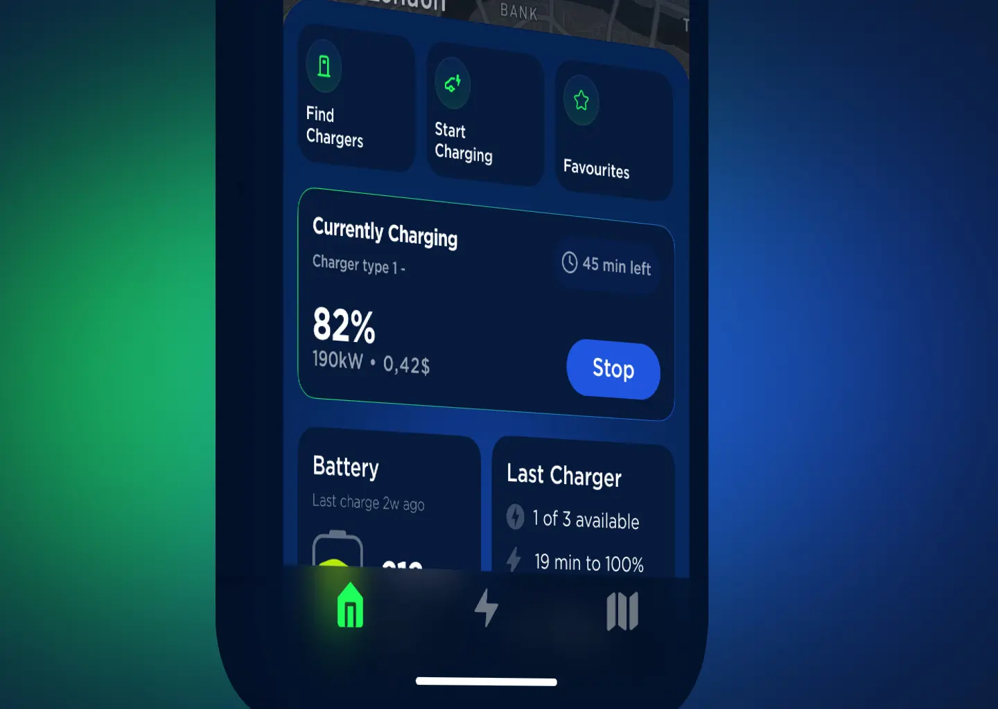
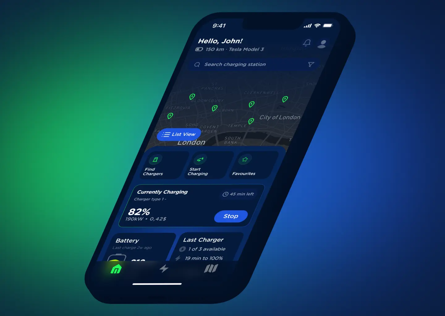
Make the active charging session the centerpiece — live stats, cost tracking, and controls — and let the map serve discovery rather than dominate.
THE RESULT
Drivers reach a trustworthy 'it's charging, here's the cost' state immediately, with far less hunting.
02
Simplify hierarchy vs. keep every feature visible
THE TENSION
Registration, charging, navigation, payment, invoicing, and integrations all compete for attention; exposing them all is complete but overwhelming.
THE CALL
Rebuilt the IA and user flows so each task surfaces in context, with a clear primary action per screen.
THE RESULT
A cleaner path through every core flow, with fewer dead ends between charging, payment, and invoicing.
03
Calm interaction vs. data density
THE TENSION
A data-rich session screen feels powerful but adds noise in a high-stress moment.
THE CALL
Used restrained interaction design — micro-interactions and state transitions that confirm what's happening without clutter.
THE RESULT
The session feels reassuring and legible at a glance, even one-handed in a parking lot.

Solution Design

Designed around the session
The redesign reorganizes the app around the highest-stress moment — the live charge — and lets the map serve discovery instead of dominating.
Session screen
Live stats, cost tracking, and controls — the new home base of the app.
Information architecture
A full app structure that surfaces each task in context across all screens and paths.
User flows
Registration, charging, navigation, payment, and invoicing — consolidated with fewer dead ends.
Interaction design
Micro-interactions and state transitions that confirm what's happening, calmly.

Critical Moments

Where the work was actually decided
Audit and personas first
I started from an audit and personas rather than visuals, so the redesign targeted the journey's real friction — the session and its handoffs — not just the UI.
Reframing the brief
I reframed the brief from 'modernize the look' to 'redesign around the highest-stress moment,' which set the hierarchy for every screen.

Impact

Expected Impact
7 → 3
Steps to a confirmed charge
From arrival to a trusted 'it's charging' state.
1 tap
To live status & cost
Down from buried under menus.
~40%
Less time to confidence
Intended, from consolidating charging, payment, and invoicing flows.
1-hand
Readable session
Key info legible at a glance, one-handed in a parking lot.
North-star: a driver's confidence during the charge — not the number of map features.

Reflection

What I'd carry forward
Validate session-first with real drivers
As a concept it leaned on an audit and personas; I'd test the session-first model with real EV drivers in a live parking-lot context to confirm the hierarchy under genuine stress.
Pressure-test the handoffs
I'd stress the payment and invoicing handoffs with edge cases — failed charges, partial sessions — earlier, since that's where trust is most fragile.
Drivers don't need a better map. They need to know the charge is working.

Let's Work
Together.

Have a project in mind? I'm always open to new ideas and collaborations. Let's talk.

Made in Warsaw with Love. All rights reserved.